

The UK's market leader for travel extras.
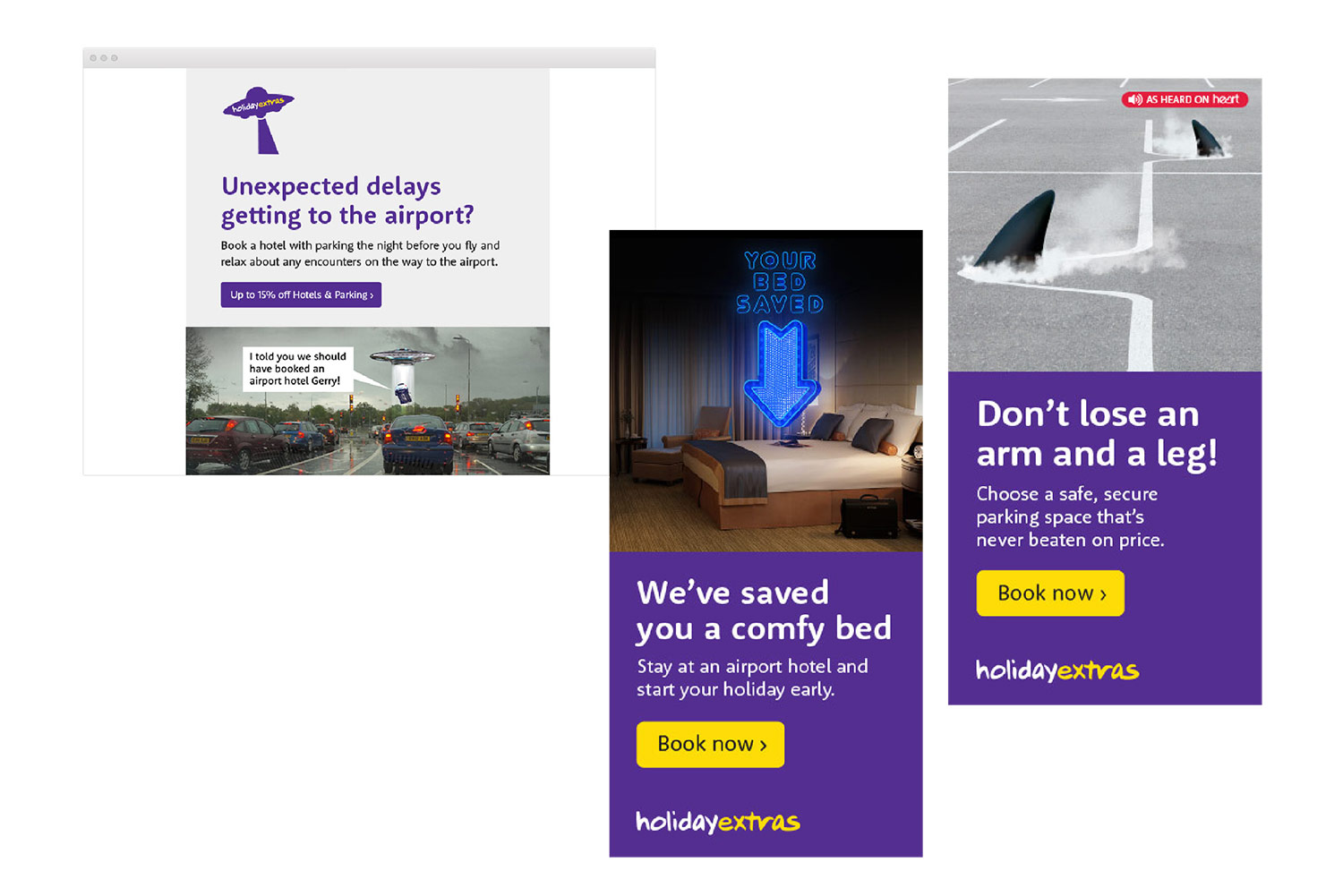
To refine and better align the brand, we brought together their key basic elements of logotype, fonts and colours. These were used in fresh and coherent ways to allow for a more consistent, but still playful, identity.
The logotype was tidied up to remove artworking errors that had crept in over time, along with new guidance on how it could be used within a range of playful new shapes. This gave the brand logo a life of its own.
Guidance was shown on how to use these assets consistently to great effect.
Our brand guidelines detailed a vast range of materials from print adverts, leaflets and stationery, to online presentations, emails and banner ads.
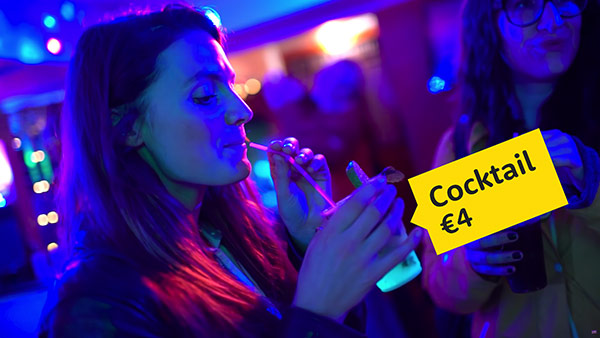
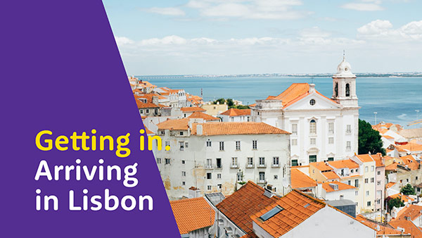
Their popular Travel Guide videos were given a revamp with fresh impacting graphics.
