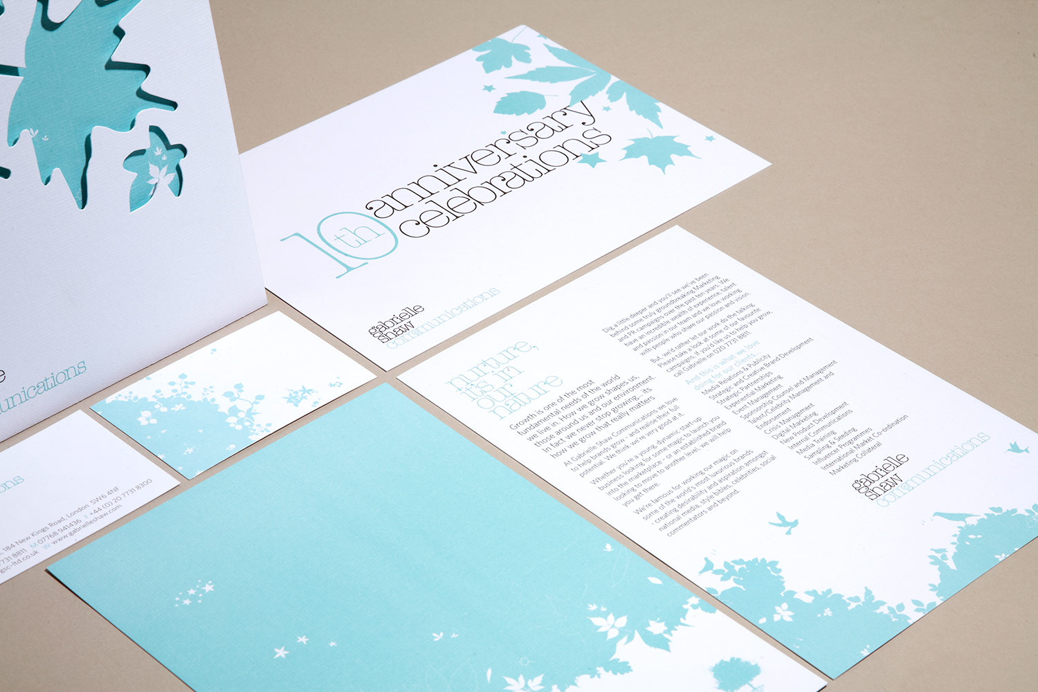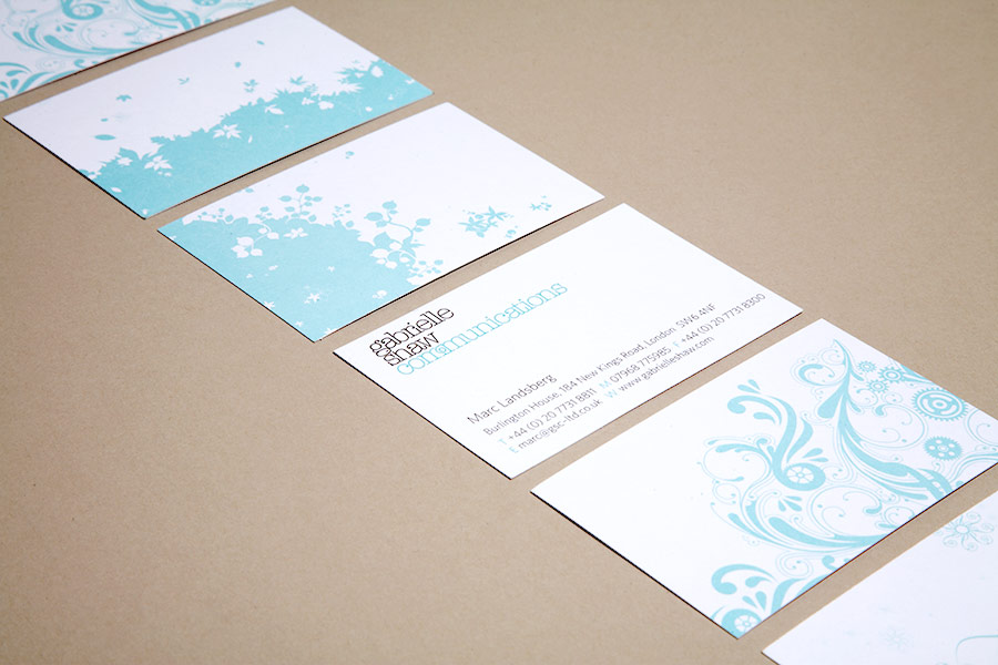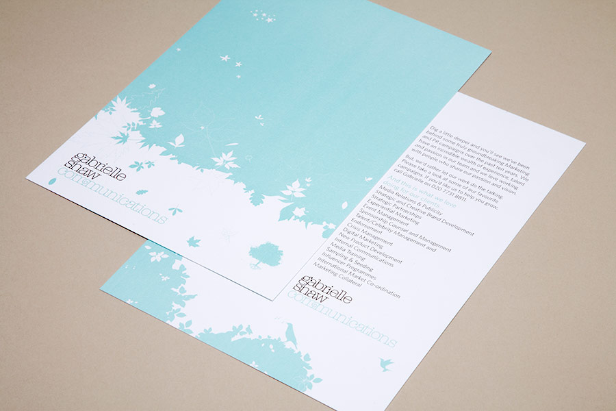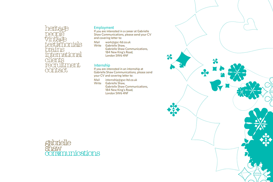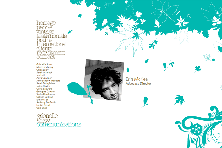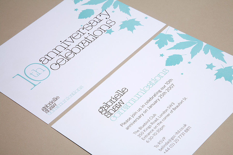
In their 10th anniversary year, Gabrielle Shaw Communications asked us to rebrand their company image to celebrate their growth and established reputation.
The typographic solution uses American Typewriter Light, with extra flourishes to create a stylish solution.
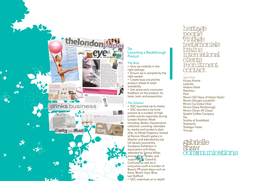
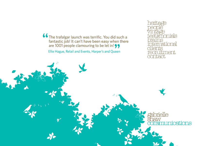
The illustrative tree logo is used as a mark and also as a branding tool for all printed and online collateral. It represents the journey that Gabrielle Shaw Communications has taken over their first 10 years, starting as an acorn and growing into a full tree.
Each section of the tree has been carefully illustrated to reveal more about the company when it is used on a larger scale.
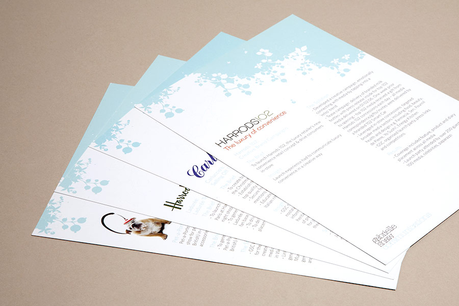
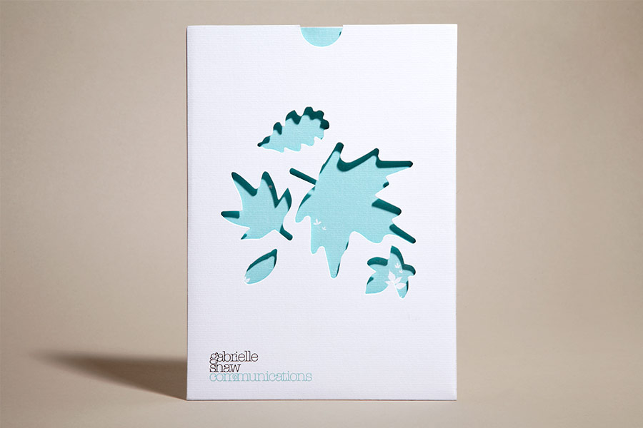
Our work included a full range of print materials which utilised the brand identity we created. The key item being a bespoke wallet brochure pack, which allowed the client to be flexible and targeted with case studies that they present to perspective clients, while still retaining a polished luxury feel which was achieved through use of textured paper stock and die cut leaves allowing their distinctive brand colours to show through and contrast against the clean white.

